DiDi Hitch Rebranding
Ride sharing app
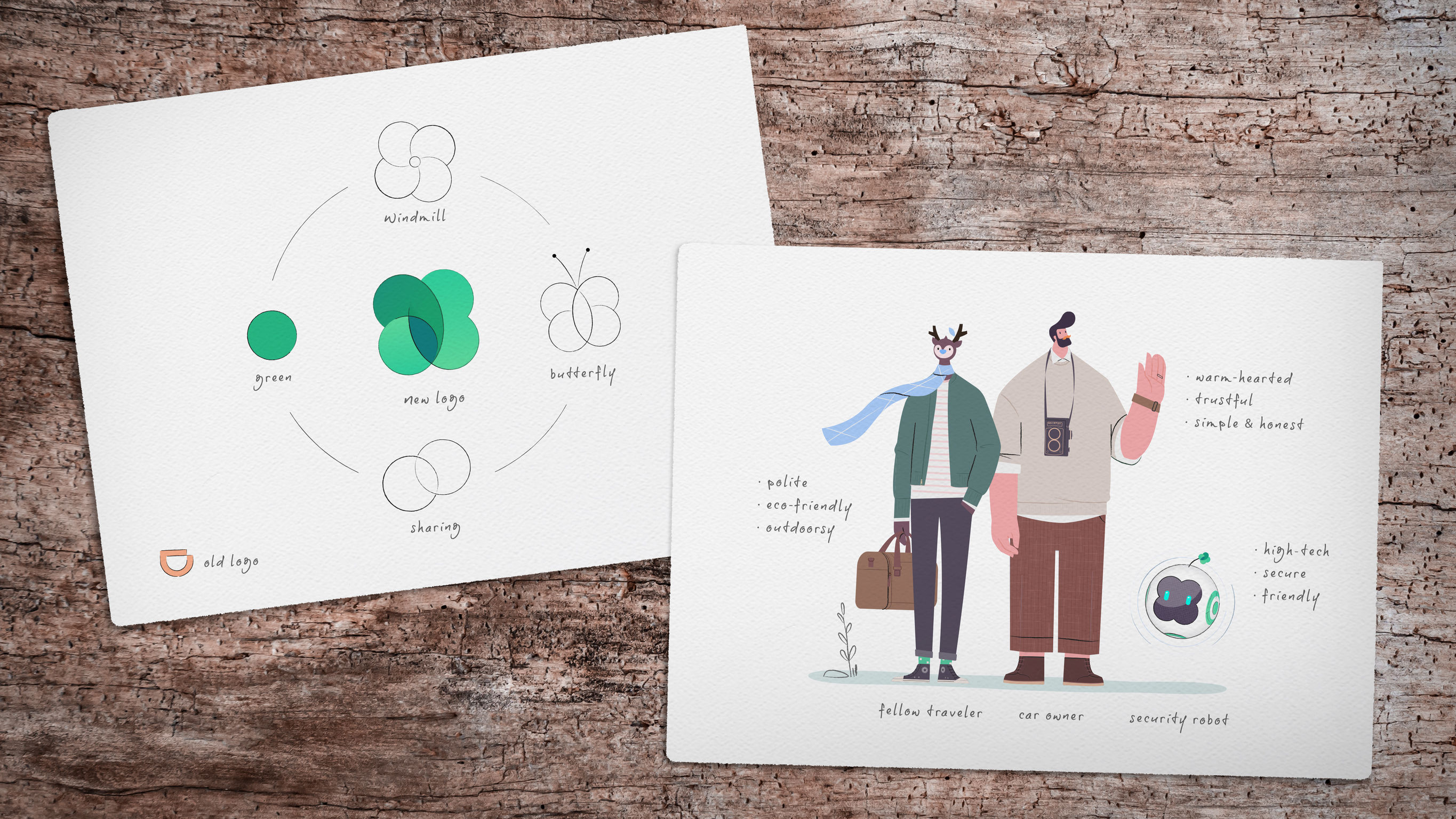
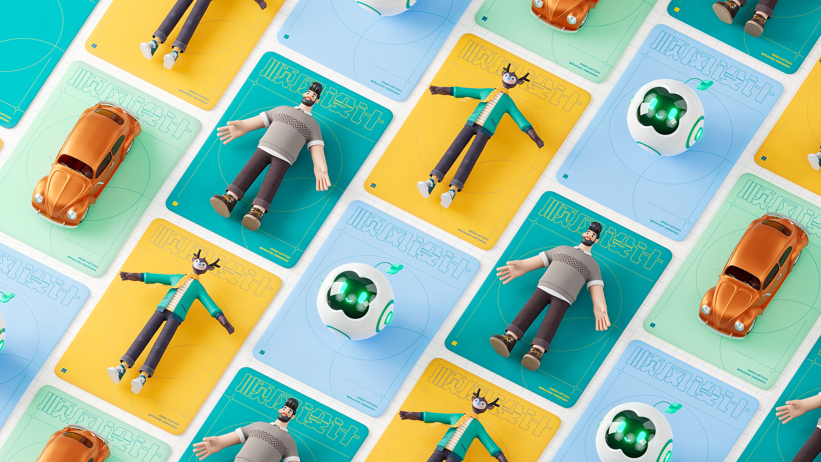
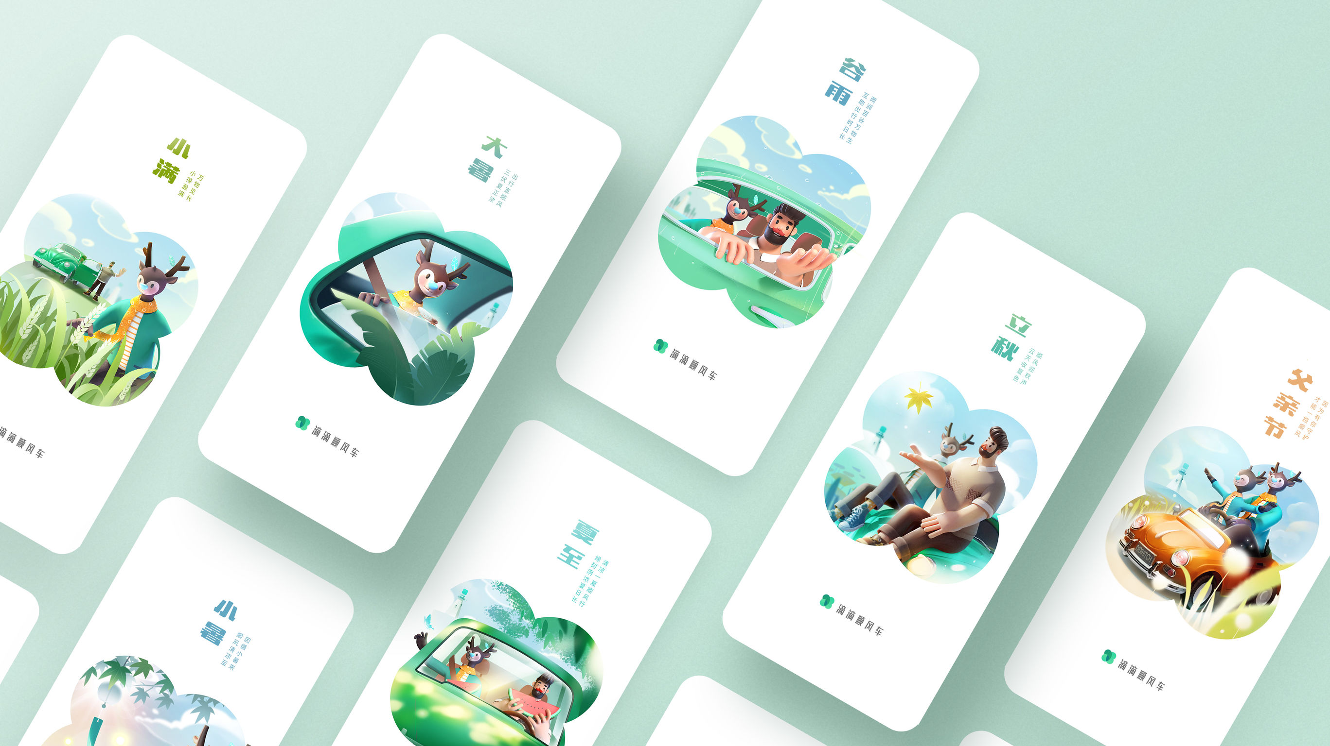
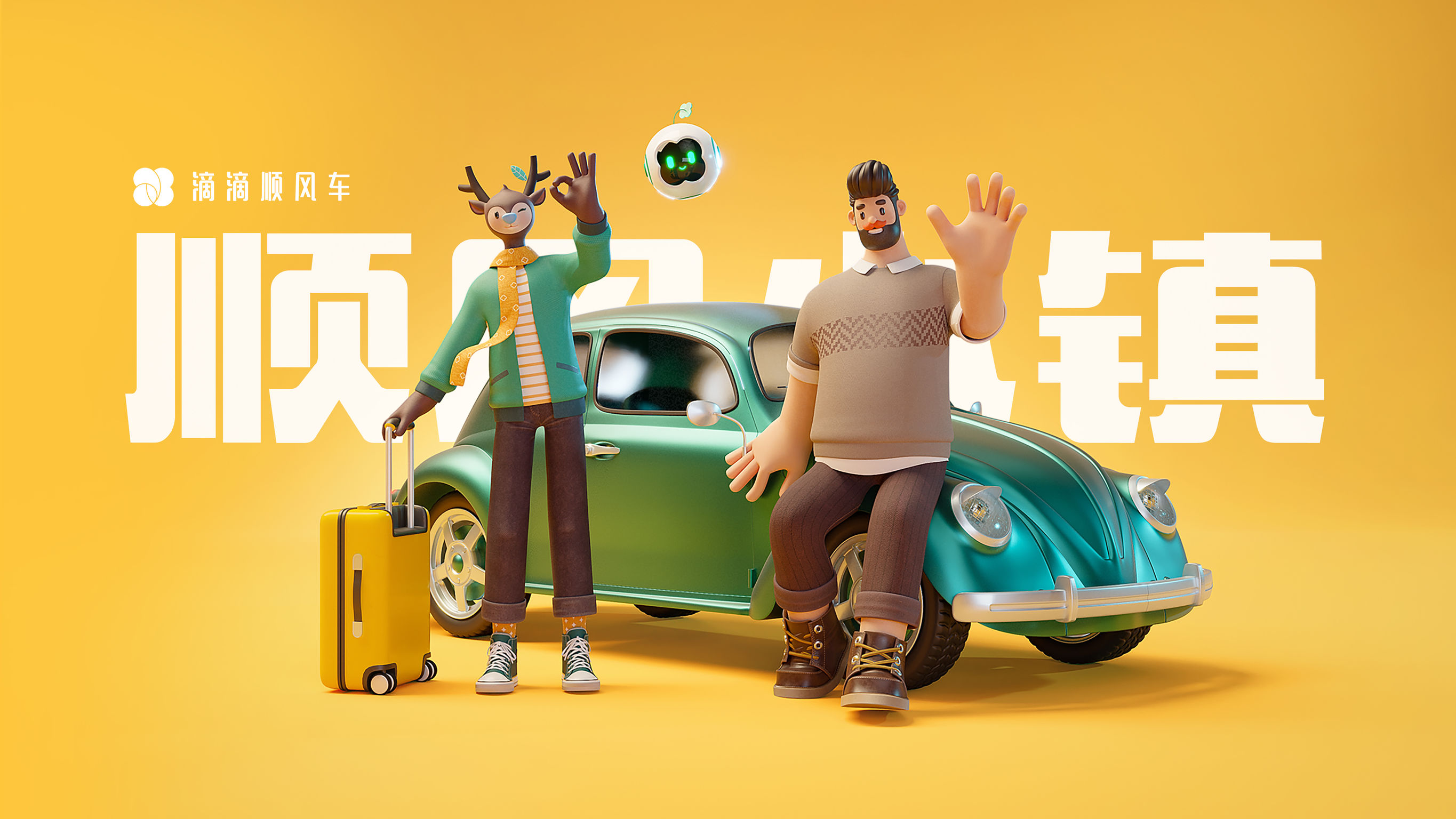
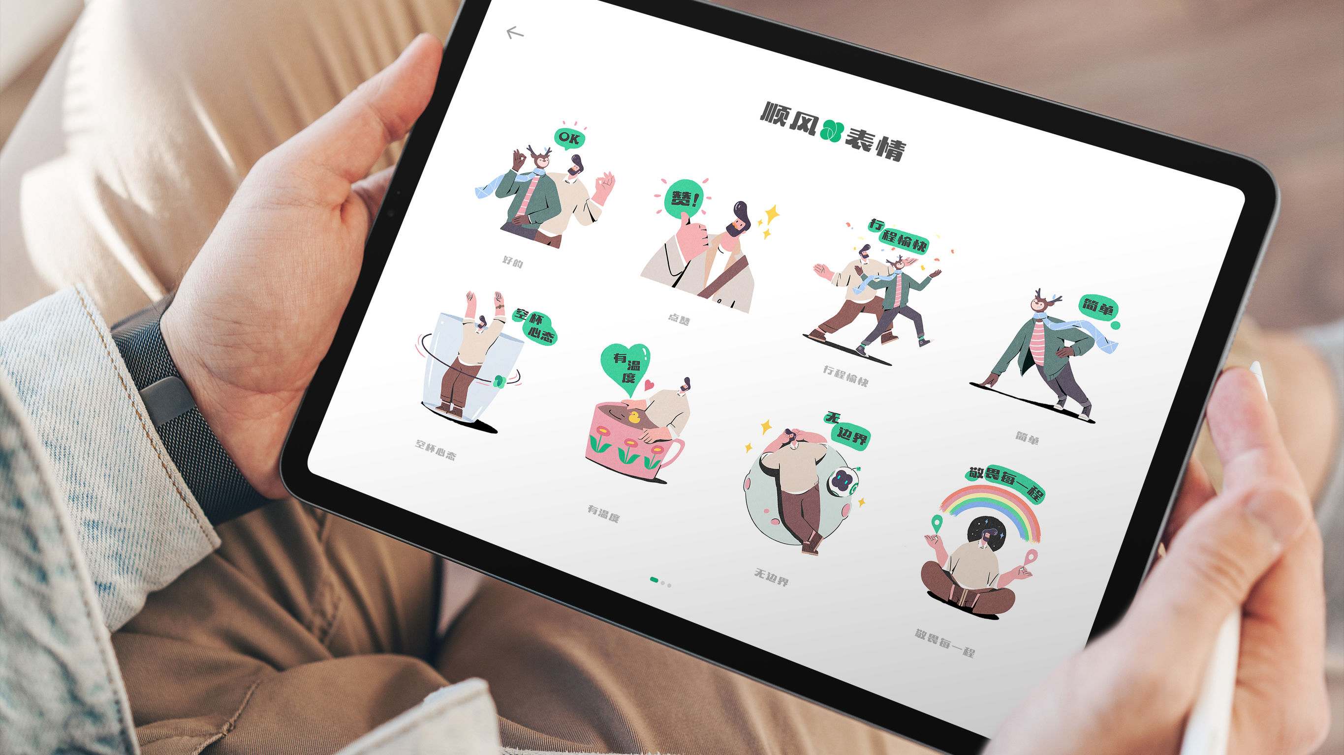
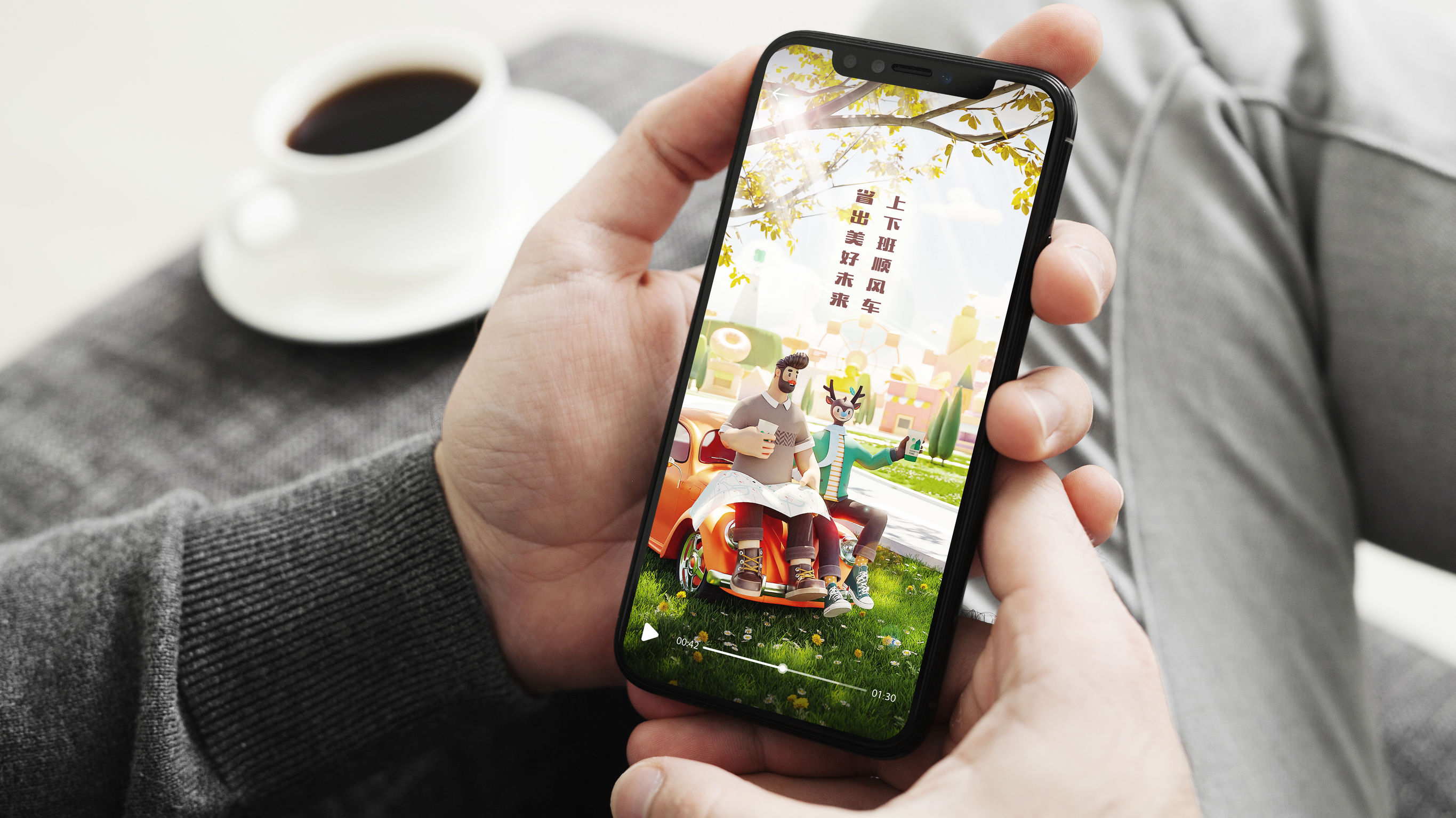
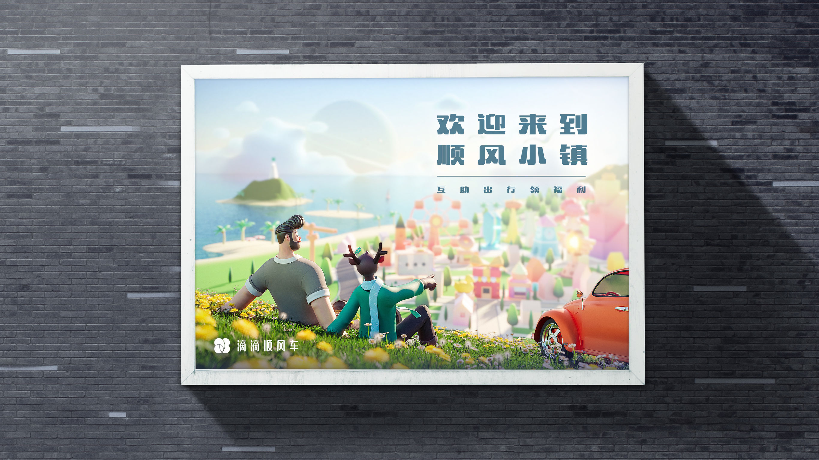
The competition in China’s C2C ride-sharing market is highly homogenized. DiDi Hitch wanted to stand apart, so it reshaped its brand image and launched an educational campaign for users to understand the company better. The design expresses the brand concept, “shared travel, better life,” in an appealing and immersive way, boosted by a new logo, three characters, and a virtual narrative. The design concept has been consistently applied to ads, videos, and gamification functions in DiDi’s app. Half a year after the rebranding, market research studies showed that users’ awareness, understanding, and recognition of the brand had increased by 6%, 20%, and 28%, respectively.
 点评此图
点评此图
 点评此图
点评此图
 点评此图
点评此图
 点评此图
点评此图
 点评此图
点评此图
 点评此图
点评此图
 点评此图
点评此图
Client / Manufacturer
DiDi Hitch
Designer
DiDi Ridea Design
查看更多信息
 点评此图
点评此图

14赞 0评论 1114人气

7赞 0评论 766人气

7赞 0评论 654人气

6赞 0评论 650人气
 关注
点赞
收藏
关闭弹幕
留言
关注
点赞
收藏
关闭弹幕
留言
确认要删除该条评论吗?
小小心意,大大鼓励
最高赞赏200元
使用支付宝扫描二维码完成支付
使用微信扫描二维码完成支付
当前余额:¥0.00
支付操作会向你普象账户的注册手机号发送验证码
请注意查收

扫一扫添加
普象商务
扫一扫添加
客服微信

扫一扫下载
手机APP

请关注公众号iamdesign或扫码关注
 沪公网安备 31011502009179号
沪ICP备13011487号-2 上海普象文化传播有限公司
沪公网安备 31011502009179号
沪ICP备13011487号-2 上海普象文化传播有限公司
留言板(0)